Role
UI Designer
Date
June 2023
Duration
8 Days
Tools
Figma

The Need for a Unified Cycling Community
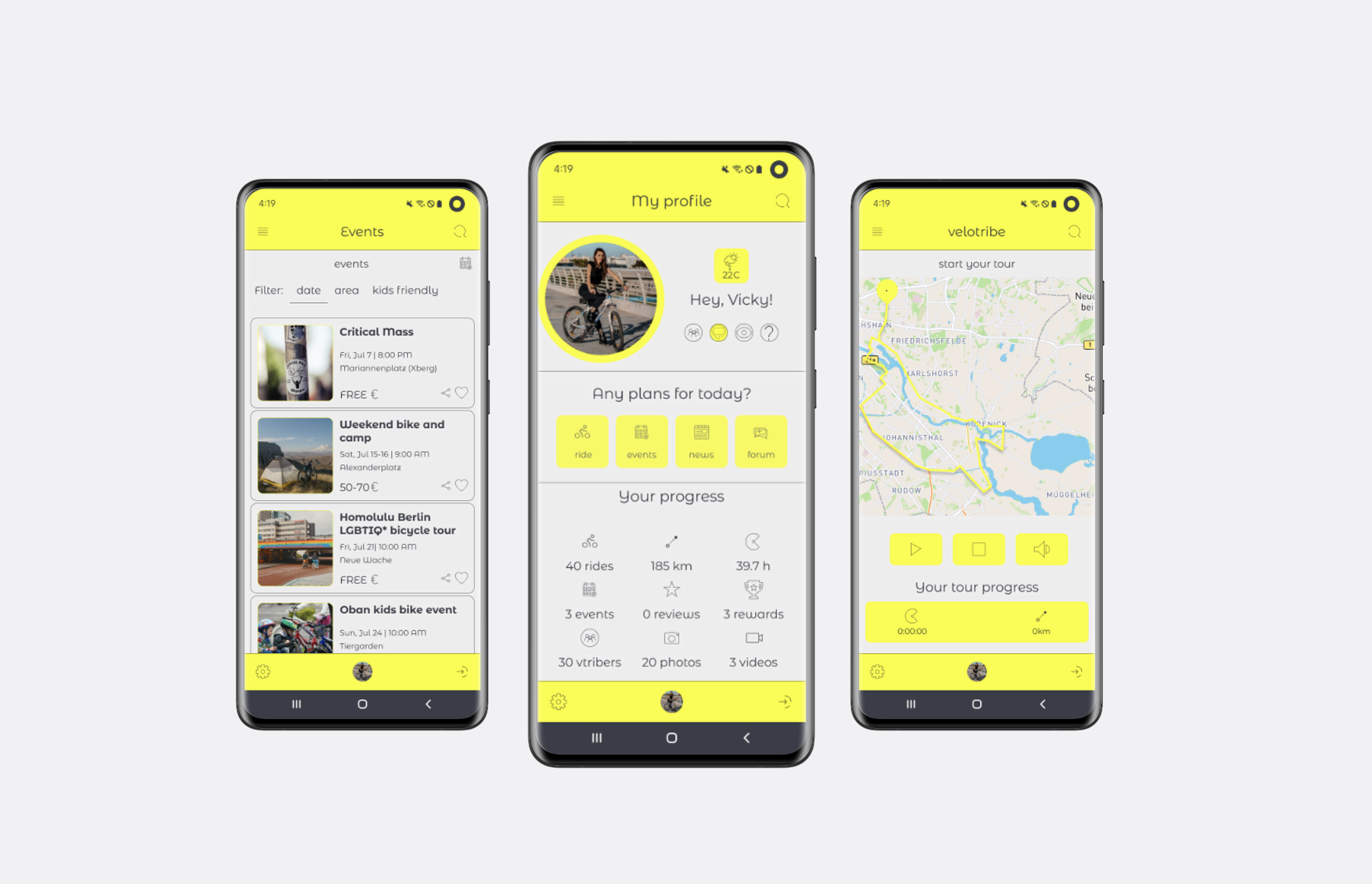
Velotribe was developed to address the challenges cyclists face in connecting with fellow enthusiasts, planning routes, and staying engaged with the latest events. The absences of a centralised platform for community interaction and support hinders their ability to deeply engage in the cycling experience.
Building a Hub for Adventures
To design a centralised, dynamic and inclusive platform that serves as a hub for the cyclist community. The task was to create a visually engaging and intuitive user interface that promotes community interaction, empowers users to explore the city’s cycling related activities effortlessly and enhances their overall cycling experience.
Creative Ideation and Brainstorming for Velotribe’s Vision
Creative ideation was deeply rooted in the User-Centric Design philosophy.
The primary focus was to uncover and address the specific needs of the target audience and discover innovative app functionalities.
With a clear understanding of the target audience’s needs, Velotribe was transformed from a simple cycling app into a central hub for the cycling community.
These insights served as a foundation for identifying and prioritising core functionalities, ensuring that the app would serve as a dynamic and inclusive platform for cyclists to connect, share experiences, and access essential resources.
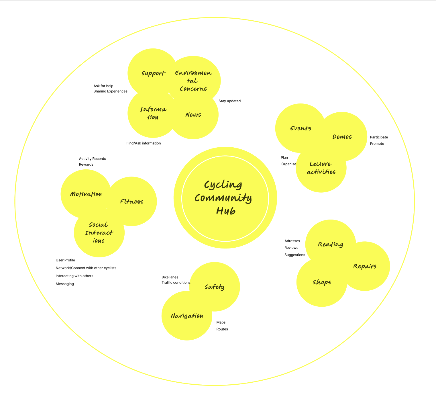
Essential Features that Power Velotribe
By understanding the needs and preferences of cyclists, I was able to develop a set of features that would meet their requirements and enhance their overall experience with the app.
Shaping the brands identity
Driven by desire to cultivate a vibrant and inclusive community for cycling enthusiasts, I developed a distinctive brand identity that resonates with our target audience and conveys the essence of the app.
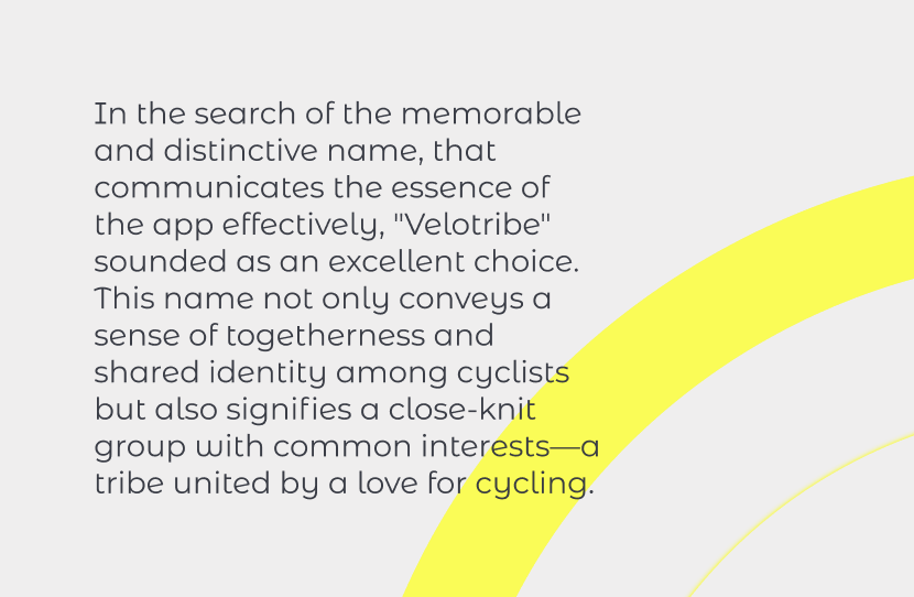
Name
Logo
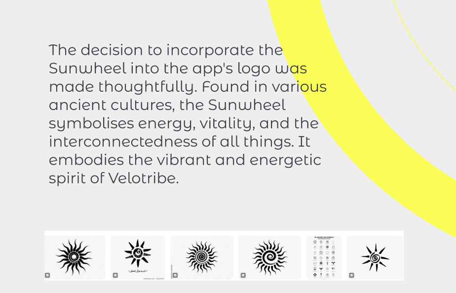
Symbolism
Brand positioning
Voice
Determining Design Elements
Color Styles
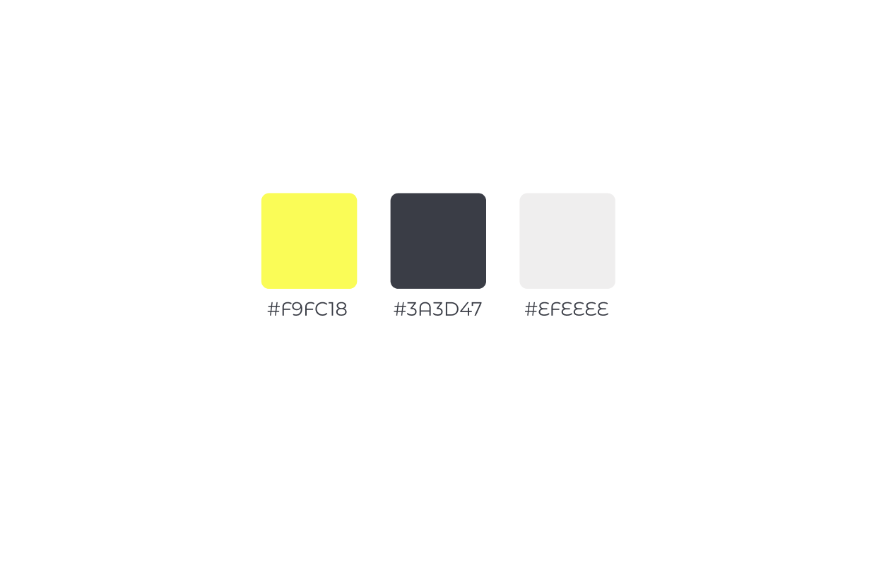
Drawing association of the “Sunwheel” to the sun, I opted for bright yellow as my primary color. The energetic yellow is grounded by the neutral grays and creates a modern, lively, and professional visual identity for the app, aligning well with the dynamic and supportive community I aiming to foster for cyclists.
Typography
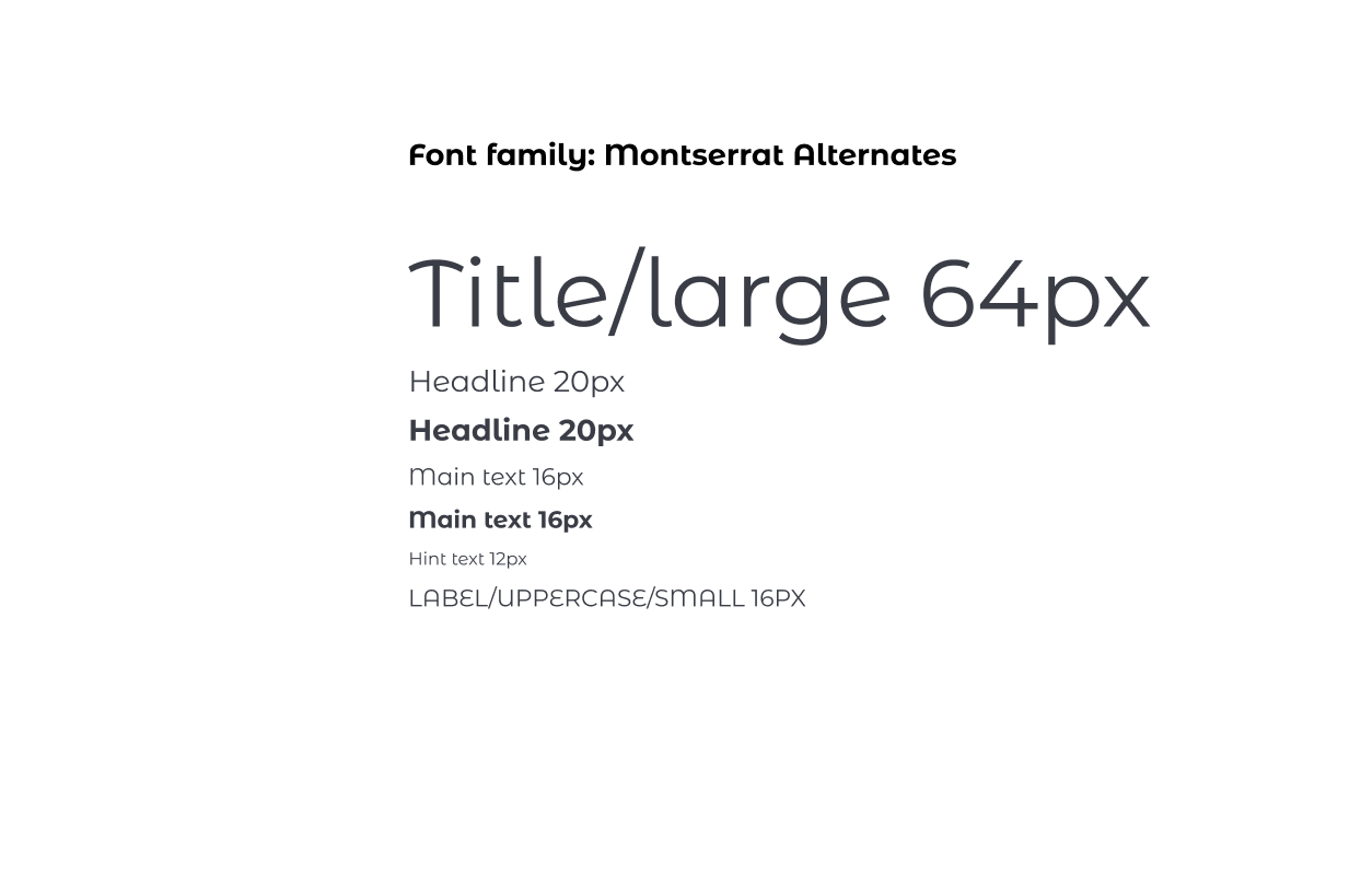
I have chosen Montserrat Alternates for its sleek and modern design, aligning perfectly with our app’s contemporary and user-friendly interface. The font’s readability ensures that the users can effortlessly navigate and engage with the app’s features. With its versatility and unique character options, Montserrat Alternates adds a touch of personal style to the app’s visual identity, creating a seamless and visually appealing experience for cyclists of all levels.
Iconography
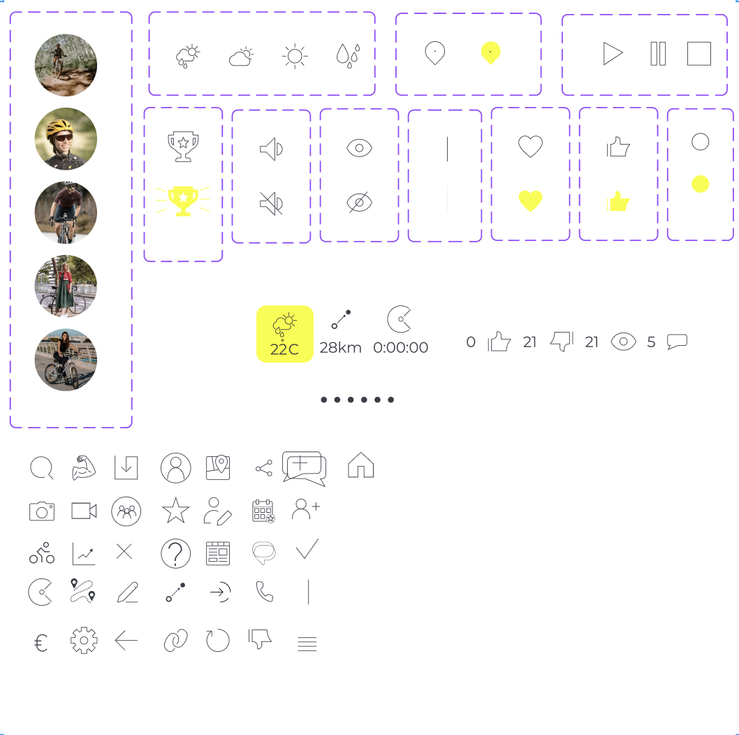
Incorporating icons to represent various functions was a strategic decision aimed at easing the user interface and minimising visual clutter. This not only enhanced the overall aesthetics of the app but also made it easier for users to navigate and interact with different features.
Each icon was carefully chosen and designed to convey its corresponding function clearly and efficiently. This approach allowed users to quickly identify and access the features they needed without being overwhelmed by text or unnecessary visual elements. Additionally, the use of icons contributed to a more universal and inclusive user experience, as they transcend language barriers and are easily understood by users from diverse backgrounds.
Components
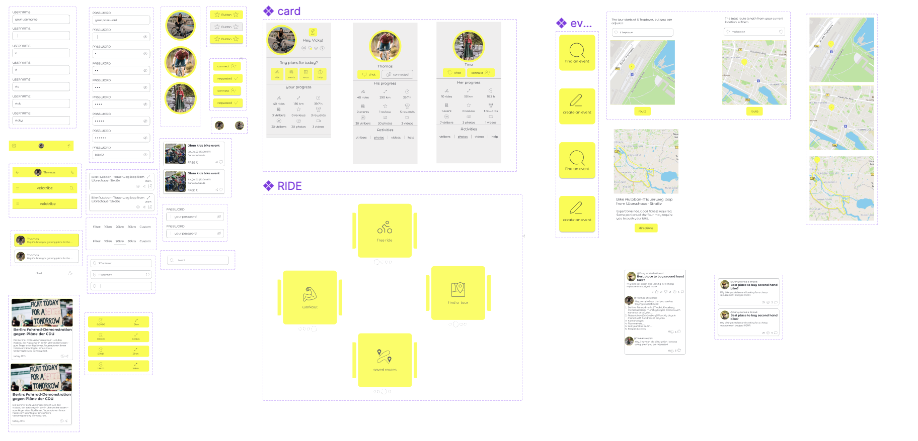
In order to enhance design consistency and efficiency throughout the development process, components and variants were employed in Figma.
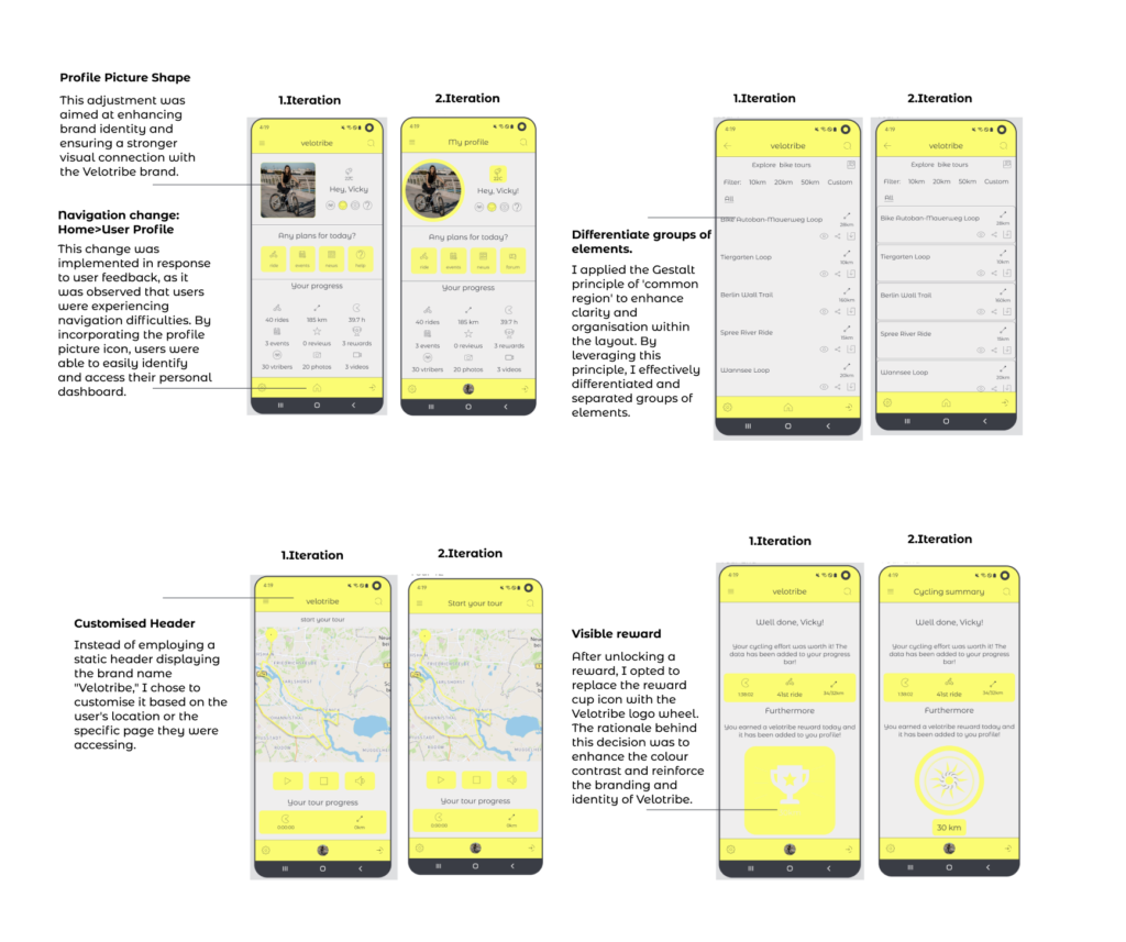
Iteration Improvements: Transitioning from Version 1 to Version 2
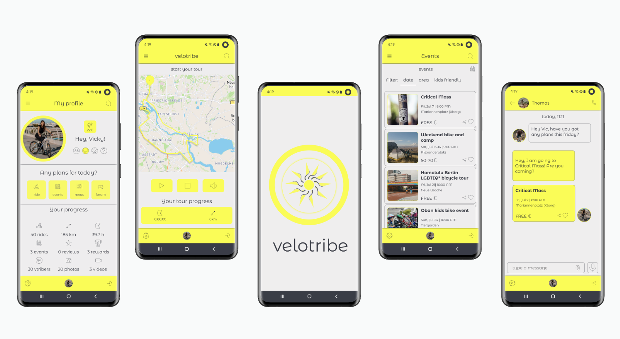
The iterations were driven by prioritising user feedback and maintaining brand consistency. The goal of these changes was to transform Velotribe into a more refined and cohesive platform, delivering an enhanced user experience and a stronger brand identity.
Engaging Interactivity Through Prototypes

Watch the final result of Velotribe to see how I reshaped the way cyclists connect, explore, and thrive!
Throughout the process of designing Velotribe, I gained invaluable insights into the power of user testing in refining and perfecting a product. User feedback provided new perspectives and opportunities for improvement that I had not previously considered.
Initially, my focus was on creating a visually appealing design and ensuring basic functionality. However, through user testing, I realised the critical role that feedback plays in shaping the app’s user experience. Incorporating user feedback into the second iteration allowed me to fine-tune the app’s features and navigation, resulting in a more intuitive and user-friendly design.
In summary, the iterative process of designing Velotribe taught me the value of persistence, resilience, and continuous improvement in delivering a product that truly meets the needs of its users.
Get in touch at
viktorijavalaviciute@outlook.com
